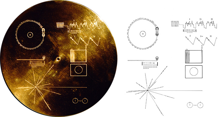
In 1977, two spacecrafts named Voyager 1 and 2 were launched from Earth to explore mostly Jupiter and Saturn for Voyager 1 and Uranus and Neptune for Voyager 2. Today, they are more than 24 billions kilometers from us, reaching the interstellar space in 2012. Recently (in June 2024), Voyager 1 and the scientists were able to communicate again and get data from 4 instruments.
Images
The NASA dedicated page provides 48 images but states that 115 images are encoded in analog form. According to the NASA the rest of the images cannot be seen due to copyright restrictions:
Due to copyright restrictions, only a subset of the images on the Golden Record are displayed above.
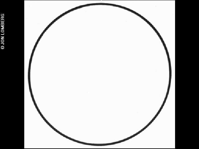
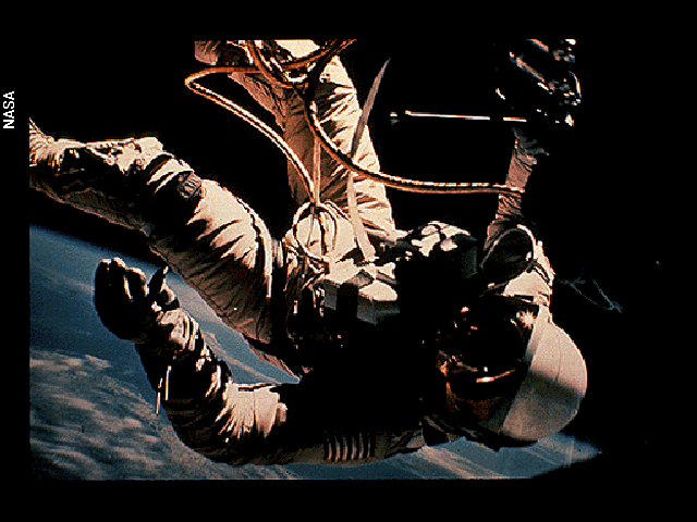
See below two examples, the calibration circle that the alien should first see if they decode it correctly and an astronaut.
So what about the rest of the pictures? With the audio of the Long Play vinyl, we could see the rest.
Published code
On Github there are many people who already achieved this decoding. More than 28 repositories dedicated to this.
Languages-wise, nothing was done in which motivates me.
Highlights
Most people are referring to this 2017 article by Ron Barry that is stellar. Passionate reading and full of information.
Marc Baeuerle did an amazing web app that decodes live the MP3 audio.
Brandon Moore did in an easy to understand script and also uploaded his extracted images. It was my main source of guidance.
Music source
Ozma Records proposes the Vinyl Set with a link the music tracks on SoundCloud.
Both the MP3 (17.7 MB) and WAV (1.4 GB) format are available on the Internet. Watch out that the sample rate is different, 44.1kHz and 384kHz respectively.
One funny thing is that one can listen to the sound of encoded images and it is not that bad after the first noisy tone.
Preprocessing
Key process is all about detecting peaks.
One first step is that remove the noisy tone which was also a peak detection procedure.
Brandon Moore loaded the full signal in memory, then iterate on both left and right channel, then iterate for each image. I took his approach but using the great feature of random access of the {fst} package. Once we have the start and end of each image, one can slice from the Fast Serialize data frame full file really fast (it is also multi-threaded).

Hence, once the noisy tone is removed, we save a fst table with 2 columns, one per audio channel and indexed by the frames.
Reading the sound track in
This is something I had zero experience before. Of course a package can do it, {tuneR} turns out to do a perfect job.
- Signal is returned as the 32bits float numbers we directly need
- Both channels neatly identified
- Sampling rate is clearly available in the object
The returned object is a S4, somehow a list with sub-setting operator being @, enough to know for our purposes.
Wave Object
    Number of Samples:      181960704
    Duration (seconds):     473.86
    Samplingrate (Hertz):   384000
    Channels (Mono/Stereo): Stereo
    PCM (integer format):   FALSE
    Bit (8/16/24/32/64):    32
Meaning, the first 10 numbers of the left channel can be obtained with:
 [1] -4.122257e-04 -3.578663e-04  6.604195e-05  4.304647e-04  3.132820e-04 -2.198219e-04 -6.819963e-04 -6.568432e-04
[9] -1.866817e-04 3.117323e-04- The length of this recording in minutes:
[1] 7.8976- We can also look at the density of those numbers:
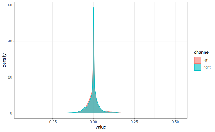
Centered around zero and within a range of -0.5 to 0.5.
Normalizing both channels signal
By divided by the maximum absolute signal:
Same density plot after normalization:
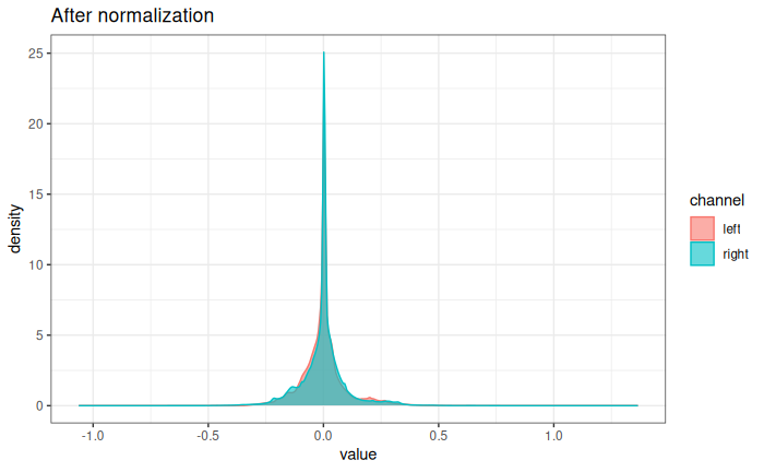
Now data range from -1 to 1.
Removing the noisy tone
Using the procedure from Brandon Moore, within the first 30 seconds, get the first bottom peak of the tone with some tweaks.
First, get a sub-sample 1 of 30s of the left channel and visualize it:
first_30s <- left_channel[1:(30 * rate)]
tibble(y = first_30s,
       x = seq_along(first_30s)) |>
  # save plotting time by random sub-sampling
  sample_n(1e4) |>
  ggplot(aes(x, y)) +
  geom_line() +
  scale_x_continuous(expand =  expansion(mult = c(.02, 0.02)),
                     sec.axis = sec_axis(\(x) x / rate, name = "Time (sec)")) +
  labs(x = "Samples",
       y = "Wave values",
       title = "First 30 seconds")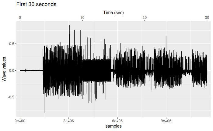
From this plot, we see the noisy tone with a large range of data until 10 seconds, than the different pictures, more details later.
Moore was using a fixed threshold and the Python function scipy.find_peaks().
We will be using the function findPeaks() from {pracma} that works identically to its equivalent.
Let’s detect from the 5% more extreme bottom values:
V1 is value, V2 index, V3 and V4 are start/end as seen below:
# A tibble: 736 × 4
      V1      V2      V3      V4
   <dbl>   <dbl>   <dbl>   <dbl>
 1 0.872 1436425 1436406 1436429
 2 0.757 1439660 1439644 1439664
 3 0.819 1443401 1443385 1443404
 4 0.766 1446618 1446604 1446621
 5 0.815 1449819 1449793 1449823
 6 0.796 1452997 1452976 1453000
 7 0.926 1456150 1456127 1456154
 8 0.814 1459294 1459278 1459298
 9 0.915 1462440 1462422 1462443
10 0.817 1465596 1465574 1465599
The peak we are looking for the last row which index is in the column V2.
Let’s zoom in the end of the noise tone and highlight the bottom peaks and the one we want.
tibble(y = first_30s,
       x = seq_along(first_30s)) |>
  slice(3612000:3890660) |>
  ggplot(aes(x, y)) +
  geom_line() +
  geom_point(data = filter(bottom_tone_peaks, V2 > 3612000),
             aes(x = V2, y = -V1),
             colour = "red") +
  geom_point(data = slice_tail(bottom_tone_peaks, n = 1),
             aes(x = V2, y = -V1),
             shape = 1, size = 5, stroke = 2,
             colour = "purple") +
  scale_x_continuous(expand =  expansion(mult = c(.02, 0.02)),
                     sec.axis = sec_axis(\(x) x / rate, name = "Time (sec)")) +
  labs(x = "samples",
       y = "Wave values",
       title = "Zooming in the noise tone end")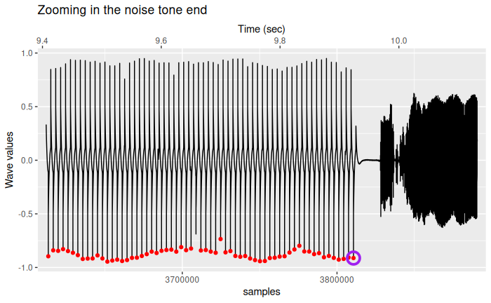
In red, the 5% bottom peaks, circled in purple the last one around 9.9 seconds. Afterwards, the pictures encoding starts.
Save a fst file for fast and efficient slicing
First we remove the noise tone, then we save a tibble of both channels as a fst file:
Reading for example the left channel from disk takes less than 0.5 seconds:
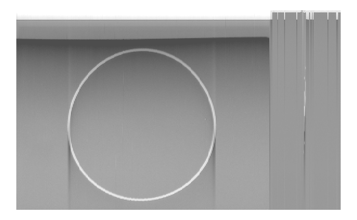
but to be able to slice from this file the image one by one, we need to know where each starts and per channel.
Decoding images from sound signal
As said before, it is about detecting peaks:
- Peaks that separate images
- For each image, peaks that separate lines
Then:
- Each line is stacked in a matrix
- Values are converted to pixel values 0-255
- Rendered as image
Find peaks that separate images per channel
And we save the results as rds files.
Peaks are again defined as the 5% most extreme peaks and we had a minimum distance between peaks, value from Brandon Moore: sampling rate divided by 5.
left_channel_no_noise <- fst::read_fst("channels_no_tone.fst", columns = "left") |> pull()
img_index_left <- findpeaks(left_channel_no_noise,
                            minpeakheight = max(left_channel_no_noise) - quantile(left_channel_no_noise, 0.95),
                            minpeakdistance = rate / 5) |>
  as_tibble() |>
  arrange(V2)
# free some memory
rm(left_channel_no_noise)
gc()

right_channel_no_noise <- fst::read_fst("channels_no_tone.fst", columns = "right") |> pull()

img_index_right <- findpeaks(right_channel_no_noise,
                             minpeakheight = max(right_channel_no_noise) - quantile(right_channel_no_noise, 0.95),
                             minpeakdistance = rate / 5) |>
  as_tibble() |>
  arrange(V2)

rm(right_channel_no_noise)
gc()
# Save the images indexes
saveRDS(img_index_left$V2, "left_img_index.rds")
saveRDS(img_index_right$V2, "right_img_index.rds")
We can check those splits for let’s say the first 3 images on the left channel:
# get tone index to represent real samples/time in audio file
noisy_tone_index <- slice_tail(bottom_tone_peaks, n = 1) |> pull(V2)
tibble(y = fst::read_fst("channels_no_tone.fst",
                         columns = "left",
                         from = 1, to = 7600000) |> pull(),
       x = seq_along(y) + noisy_tone_index) |>
  sample_n(1e5) |>
  ggplot(aes(x, y)) +
  geom_line() +
  geom_vline(data = tibble(x = readRDS("left_img_index.rds")[1:3]) + noisy_tone_index,
             aes(xintercept = x),
             colour = "red") +
  scale_x_continuous(expand =  expansion(mult = c(.02, 0.02)),
                     sec.axis = sec_axis(\(x) x / rate, name = "Time (sec)")) +
  labs(x = "samples",
       y = "Wave values",
       title = "Finding image indexes")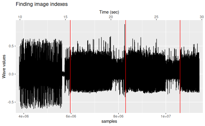
From now, we will work with 3 files on disk:
- The main
fstfile that contains 2 columns, left/right audio 32bits floats without the leading noise tone (2.7GB) - Index of the start of images for the left channel:
left_img_index.rds(450B) - Index of the start of images for the right channel:
right_img_index.rds(454B)
The calibration circle
This is the first image of the left channel, meant to help aliens finding the right parameters to read the golden record.
Let’s create two routines to
- Slice the right signal of the desired image
- Find lines for one image
# default to the calibration circle
extract_img_signal <- function(channel = "left", index = 1) {
  channel <- match.arg(channel, c("left", "right"))
  if (index < 1 | index > 78 | !is.numeric(index)) stop("image index must be a positive integer < 78")
  fst::read_fst("channels_no_tone.fst",
                              columns = channel,
                              from = readRDS(paste0(channel, "_img_index.rds"))[index],
                              to = readRDS(paste0(channel, "_img_index.rds"))[index + 1])[[channel]]

}
img_signal <- extract_img_signal()


find_row_indexes <- function(img_signal) {
  # threshold obtained thanks to amazing-rando
  # https://github.com/amazing-rando/voyager-decoder/blob/master/voyager-decoder.py
  findpeaks(img_signal,
            minpeakheight = 0.05,
            minpeakdistance = rate / 100) |>
    as_tibble() |>
    arrange(V2)
}

row_index <- find_row_indexes(img_signal)
Again the row_index is a 4-columns tibble where V2 is the index of start of each image line.
Check those indexes
tibble(y = img_signal,
       x = seq_along(img_signal)) |>
  filter(x < 1.5e6) |>
  sample_n(1e5) |>
  ggplot(aes(x, y)) +
  geom_line() +
  geom_vline(data = filter(row_index, V2 < 1.5e6),
             aes(xintercept = V2),
             colour = "red") +
  scale_x_continuous(expand =  expansion(mult = c(.02, 0.02)),
                     sec.axis = sec_axis(\(x) x / rate, name = "Time (sec)")) +
  theme_bw() +
  labs(x = "samples",
       y = "Wave values",
       title = "Finding row indexes")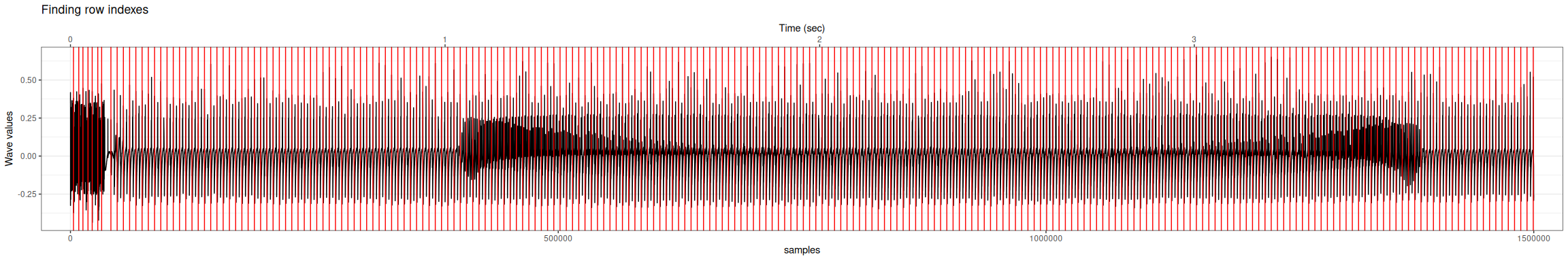
As Ron Barry was writing for his Figure 6:
You can clearly SEE the circle in the rendering
From 1 sec to 3.5 the circle is indeed visible in the signal. For this first image, we have 6.06 seconds of audio (row_index$V2[nrow(row_index)] - row_index$V2[1]) / rate)
Building the image line by line
Again, we write a function using the constants discovered empirically by Brandon Moore. The THICKNESS where he repeated each line 15 lines did not prove to be useful, so this is skipped here.
However, his clipping of extreme values and rescaling to 0-255 values were really good and implemented in .
The cleaning of the signal was done based on the densities.
fill_img_matrix <- function(img_signal, remove_noise = TRUE) {

  row_index <- find_row_indexes(img_signal)
  SCANWIDTH <- 3000
  BORDERS <- 10
  img_data <- matrix(nrow = (SCANWIDTH), ncol = length(row_index$V2) - 2 * BORDERS - 1)

  mat_col <- 1
  for (row_signal in row_index$V2[-c(1:10, (length(row_index$V2) - 10):length(row_index$V2))]) {
    line <- img_signal[row_signal:(row_signal + SCANWIDTH - 1)]
    #message("line ", mat_col, " ", mean(line), " mode ", max(density(line)$y))
    img_data[, mat_col] <- line
    mat_col <- mat_col + 1
  }
  if (remove_noise) {
    # get the mode of all lines, and 80% of data.
    # on the left side, real signal while above we get only noise with flat signals.
    mean_mode <- apply(img_data, 2, \(x) max(density(x)$y)) |>
      quantile(0.8)
    genuine_lines <- apply(img_data, 2, \(x) max(density(x)$y) < mean_mode)


    # clean up columns that contains no real signal
    img_data <- img_data[, genuine_lines]
  }

  # clip extreme values
  low <- quantile(img_data, 0.02)
  high <- quantile(img_data, 0.98)
  img_data[img_data < low] <- low
  img_data[img_data > high] <- high
  # rescale for 0 - 255
  img_data <- 255 - ((img_data - low) / (high - low)) * 255
  img_data
}

# for grey images, we can remove noise, but for colors it shifted the 3 RGB
img_data <- fill_img_matrix(img_signal, remove_noise = TRUE)


# plot with rotation
image(t(img_data), col = gray.colors(255))
base natively supports to convert a matrix of values to an image:
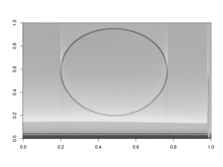
Looks good enough, but we can also use {ggplot2} to do the plotting with geom_raster().
since we have defined functions, we can write a pipeline to read any images from any channel:
extract_img_signal(channel = "left", index = 1) |>
  fill_img_matrix() |>
  as_tibble() |>
  mutate(x = row_number(), .before = 1) |>
  pivot_longer(cols = -x,
               names_to = "y",
               names_prefix = "V",
               names_transform = list(y = as.integer),
               values_to = "value") -> img_longer
img_longer |>
  ggplot(aes(y, x, fill = value)) +
  geom_raster() +
  scale_y_continuous(transform = "reverse") +
  scale_fill_gradient(low = "white", high = "grey30") +
  theme_void() +
  theme(legend.position = "none")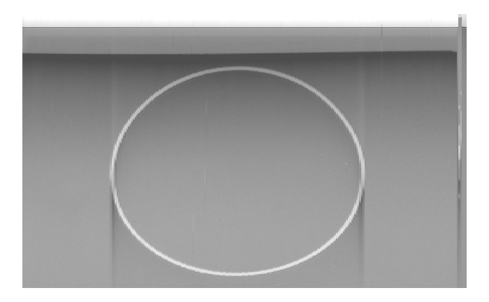
Densities of signal
Removing “noise” it is really difficult. Moore has some hard-coded threshold. I went for again a quantile approach after comparing different slices of signal.
For example, let’s not remove the “noise” for the circle:
Same code as before for a ggpplot2 output but with:
The of the images is not meaningful. Let’s see the signal profile per slice:
filter(img_longer, y %in% c(2, 100, 200, 280, 300)) |>
  ggplot(aes(x, value)) +
  geom_line() +
  facet_wrap(vars(factor(y)), ncol = 1)

filter(img_longer, y %in% c(2, 100,  200, 280, 300)) |>
  ggplot(aes(value)) +
  geom_density() +
  facet_wrap(vars(factor(y)), ncol = 1)
# for each line, what is the mode of its values
img_longer |>
  summarise(mode = max(density(value)$y), .by = y) |>
  ggplot(aes(mode)) +
  geom_density() +
  geom_vline(aes(xintercept = quantile(mode, 0.95)), color = "red")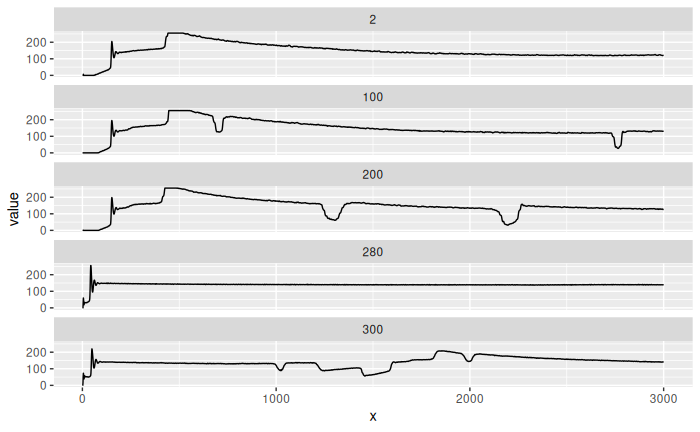
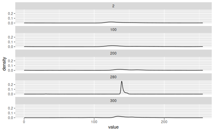
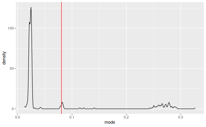
We see that noise has higher values (based on the mode), so we remove lines with mode in the most 20% extreme.
More examples
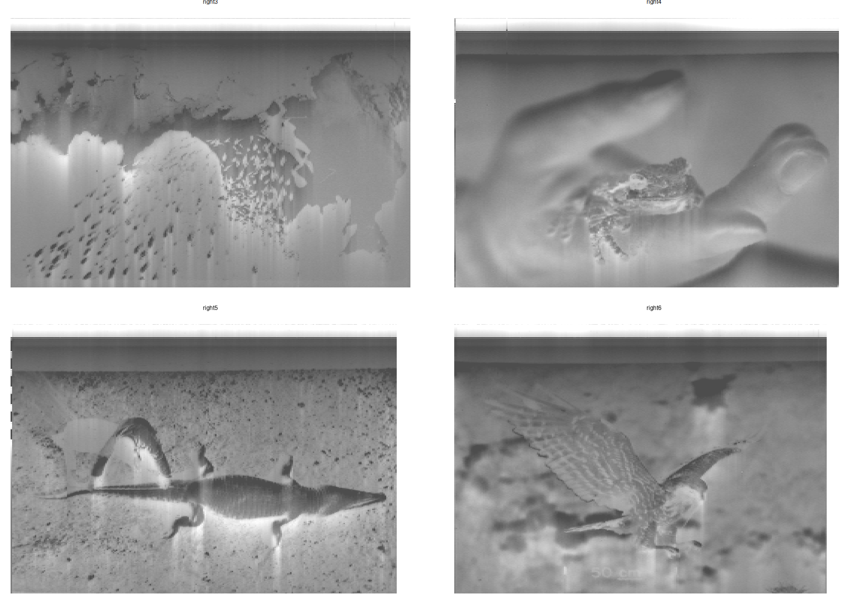
Images 3 to 6 on the left signal:
3:6 |>
  set_names(nm = \(x) paste0("left", x)) |>
  imap(\(img_index, i) {
    message("extracting image ", i)
    extract_img_signal(channel = "left", index = img_index) |>
      fill_img_matrix(remove_noise = TRUE) |>
      as_tibble() |>
      mutate(x = row_number(), .before = 1) |>
      pivot_longer(cols = -x,
                   names_to = "y",
                   names_prefix = "V",
                   names_transform = list(y = as.integer),
                   values_to = "value") |>
      mutate(img = i)
  }, .progress = TRUE) |>
  # join all tibbles in the longer format
  list_rbind() |>
  ggplot(aes(y, x, fill = value)) +
  geom_raster() +
  scale_y_continuous(transform = "reverse") +
  scale_fill_gradient(low = "white", high = "grey30") +
  facet_wrap(vars(img), ncol = 2) +
  theme_void() +
  theme(legend.position = "none")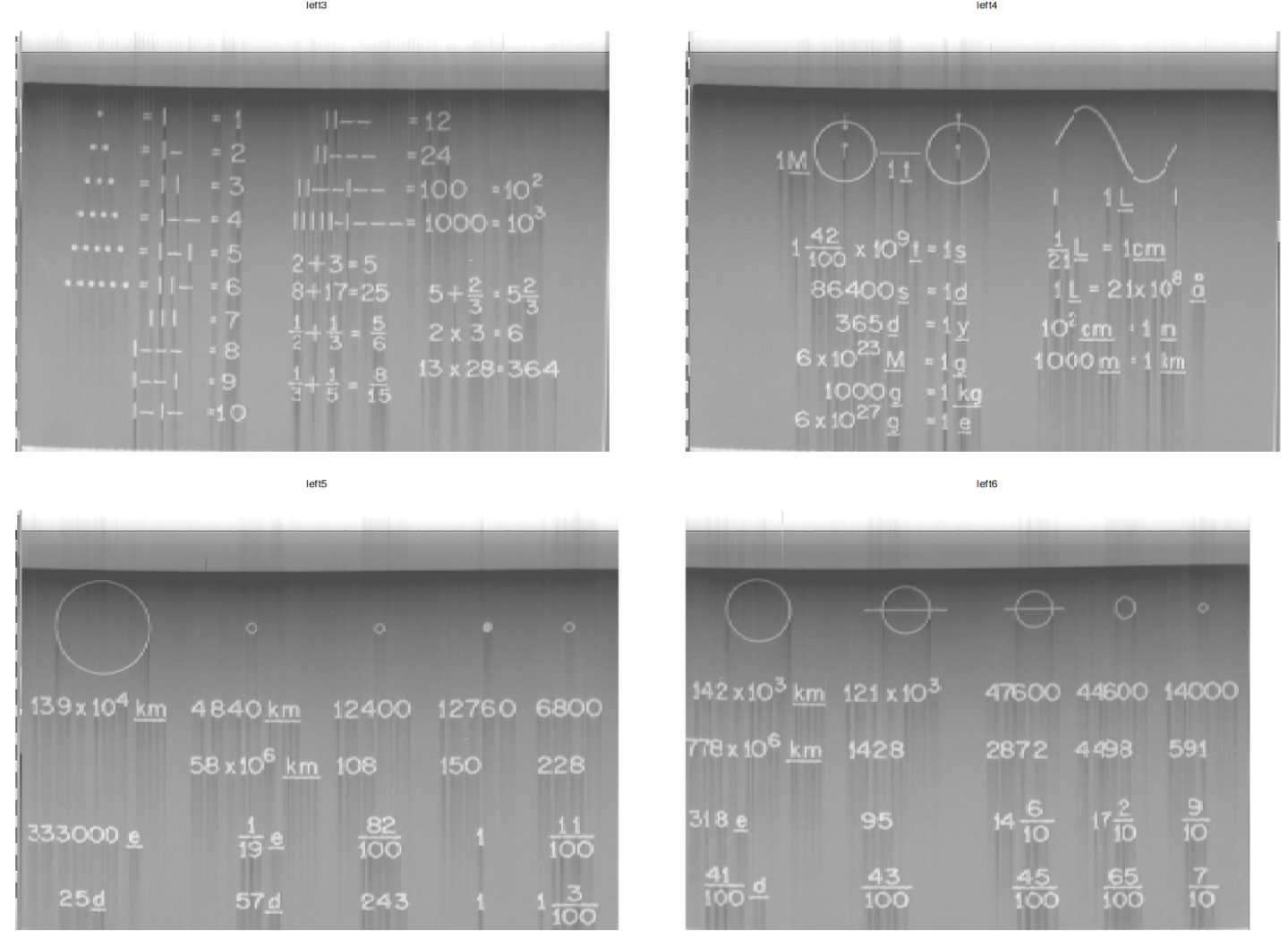
On the right channel, still images 3 to 6:
Color images
Still a work in progress due to misalignment between the 3 color channels: Red, Green, Blue.
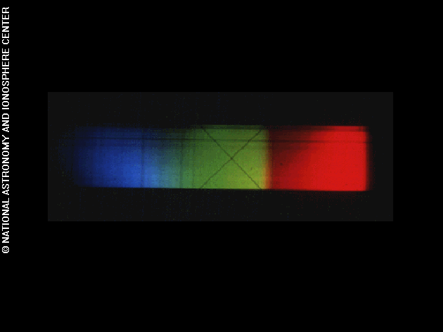
For example the Sun spectra is on the left channel in images 8, 9 and 10. Each matrix of 0-255 values are then bundle in rgb() and displayed with rasterImage().
c(8, 9, 10) |>
  set_names(nm = \(x) paste0("l", x)) |>
  imap(\(img_index, i) {
    message("extracting image ", i)
    extract_img_signal(channel = "left", index = img_index) |>
      fill_img_matrix(remove_noise = TRUE)
  }, .progress = TRUE) -> sun_spectra

# tailor down matrices to the minimum one
map_int(sun_spectra, ncol) |> min() -> min_col

# rgb idea from baptiste https://stackoverflow.com/a/11306342/1395352
spectra <- rgb(sun_spectra[[1]][, seq(1, min_col)],
               sun_spectra[[2]][, seq(1, min_col)],
               sun_spectra[[3]][, seq(1, min_col)],
               maxColorValue = 255)
dim(spectra) <- c(nrow(sun_spectra[[1]]), min_col)

# rasterImage
# https://stackoverflow.com/a/62135604/1395352
plot.new()
rasterImage(spectra, interpolate = FALSE,
            xleft = 0, xright = 1, ytop = 0, ybottom = 1)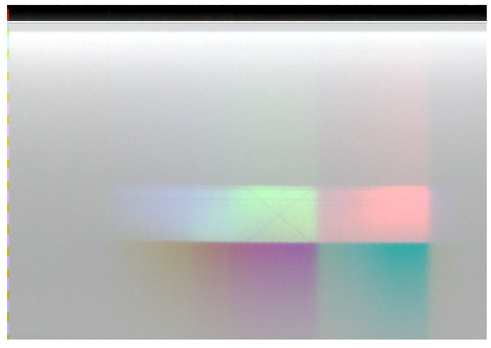
Compare to the original picture, it could be better:
Acknowledgements
- Ron Barry for inspiring article.
- Brandon Moore for easy to follow code.
- Baptiste for creating
rgbimages. - Hadley Wickham for the
tidyverse. - The community for being welcoming and fruitful discussions.
Copyright pictures
Pictures are copyrighted by the NASA/JPL and from the NASA Voyager site. JPL stands for Jet Propulsion Laboratory.
Footnotes
10,000 values are enough to see the shape, saves plotting time. 100,000 were a good compromise too.↩︎